Meredith Price
FanFood
Visual Design
While interning at FanFood, I created the graphic and visual layers for wireframes of new app features. Along with Ux designers, researchers, and Developers we redesigned the website to reflect FanFood's new mission, set to launch in January 2021. I also Generated engaging B2C and social media content for marketing and media platforms.


Visual Design for the Chicago based Start-up, FanFood.
PROJECT CONTENTS
Splash Animation
Marketing Graphics
Website Redesign
App Features
Contactless Ordering for Dine-In, Pickup and Delivery with the quickest and easiest-to-use online ordering platform.
CREDITS
John Welch - Product Manager
Frauline Agarin - UX Researcher
Jayden Maloto - Product Designer
Meredith Price - Visual Designer
Timeline
Jun - Dec 2020
Our goal was to strengthen the UI/UX of our consumer app by testing usability, resulting in a decrease of user confusion and a simpler, easier ordering experience.
Our goal was to strengthen the UI/UX of our consumer app by testing usability, resulting in a decrease of user confusion and a simpler, easier ordering experience.
AS VISUAL DESIGNER, MY PRIMARY ROLE INCLUDED
-
Working with UX designers, researchers, and marketing to redevelop the website that is easier to navigate, reduced redundancy and highlighted the most important feature of FanFood: Contactless ordering and delivery in an easy to use way.
-
Improving the visual design of the app, going in tandem with increasing user ability through frequent prototyping and testing resulted in continuous app improvements.
-
Designing a splash screen animation to be used on the open and loading of the app that elevated the brand.
-
Maintaining consistency in branding, messaging, and style within new app features and app improvements.
-
Updating colors to reflect ADA compliance guidelines for digital product.
-
Helping to establishing a team-wide design process. Doing so helped our team perform efficiently and helped solidify work expectations for a growing product team especially in a virtual environment.
-
Using Figma for easy collaboration between FanFood designers and collecting files for future design work.
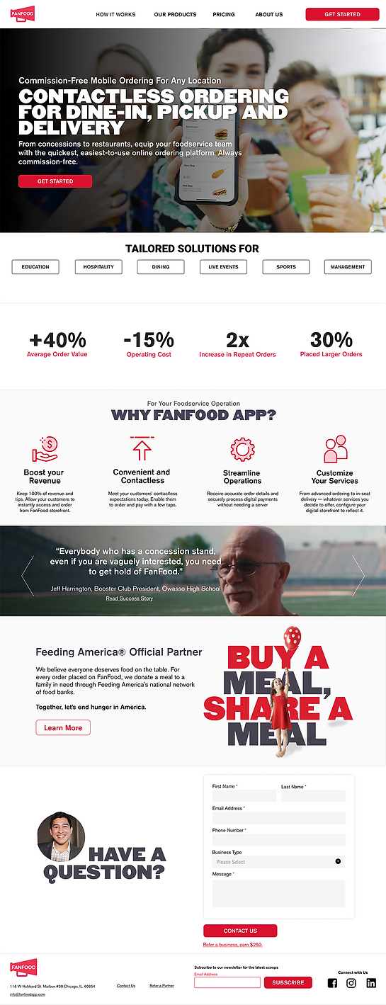
I created the graphic and visual layers for wireframes of the website. Along with UX designers, researchers, and developers, we redesigned the entire website to reflect FanFood's new mission, launching in 2021.
Main Goal: Focus on B2B interactions, directing visitors of the site to how they can implement FanFood's technology into their business.
Key components: stronger branding and clear copy writing, easier navigation through the site, eliminate redundant and repeated information, highlight FanFood's values like customer happiness and small business support, create a more sophisticated and clean design with cohesive colors, typography, and visuals.
Website Redesign


Lots of imagery and visuals were important to show off FanFood's product as well as reinforce their focus on the customer experience.


Following brand guidelines, I generated engaging B2C and social media content for marketing and media platforms to grab users attention and increase social media engagement.
MARKETING GRAPHICS


CASE STUDY - APP DESIGN & USABILITY TESTING
20% of users incorrectly completed the task requested and 60% of users expressed confusion while entering order details.
Led by our researcher, we connected with 10 individuals to test the usability of our platform. Almost all identified as frequent users of mobile food ordering apps and were asked to perform a FanFood order from bagging to checkout. The average recommendation score from our users was about a 5.9 out of 7.

5/10 users miss the initial "Date/Time" module and are surprised to be adjusting it at checkout. In addition, the vocabulary "Order Now" and "Order Ahead" was confusing to users.
4/10 users were not satisfied with the checkout process, mainly having trouble with the payment module and overall crowdedness of single-page elements.

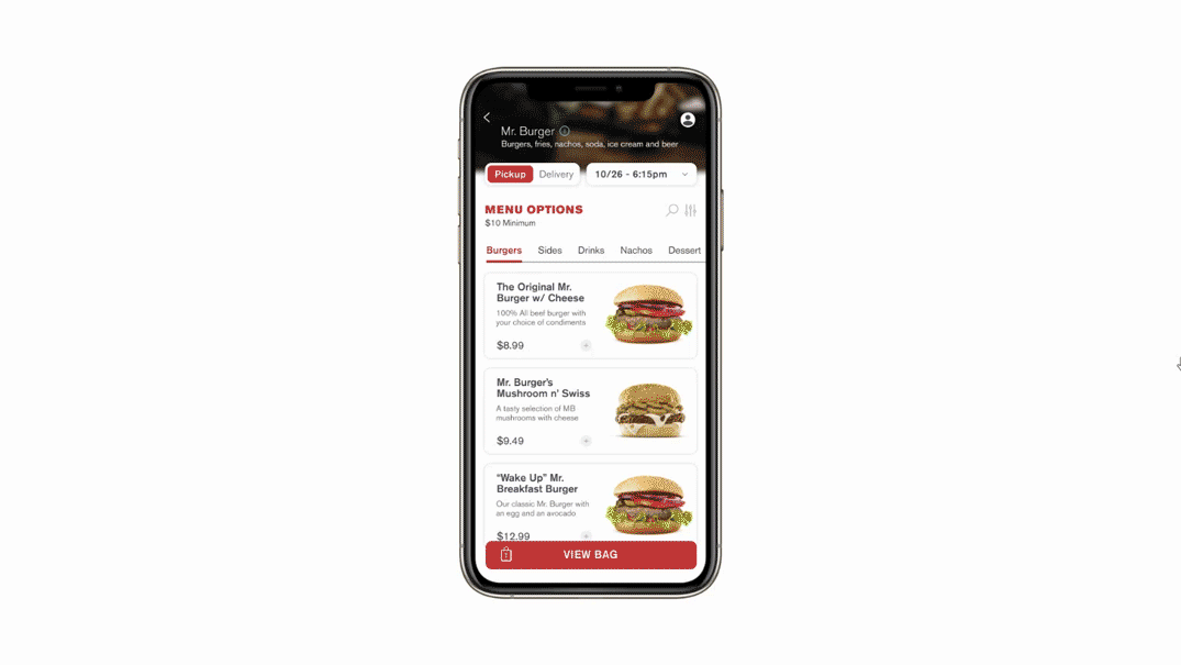
SOLUTION #1


Ability to edit order details throughout any process of the order and "Pickup" and "Delivery" modules alongside time modal.
These modals are consistent throughout the app and feature a sleeker design that takes up less realestate on the app.
Visual design of the new feature, highlighting the top modals, for easy access and clarity for the user.


More intuitive checkout flow that reinforces user's sense security and ease, allowing clarity between modules and steps in the placing order process.
SOLUTION #2
Studies show the use of the blue and security icons reinforce user security of payment.

Working on a Product team created an entirely new experience for me. I combined business goals to target consumers and enhance user experience through UX and visual design. Extensive design process, consistency, and quality of product is key to create new solutions that enhance user experience and increase the quality of product.
TAKEAWAYS